Tag: Source edit |
(Undo revision 108905 by Jerusalemlightrail (talk) Maximum isn't a scare factor) Tag: Undo |
||
| Line 137: | Line 137: | ||
13th logo: Medium. The newer version of the mask is ugly and the announcer is still pretty startling, but like the last logo, this is still tamer than the 1st and 6th logos. |
13th logo: Medium. The newer version of the mask is ugly and the announcer is still pretty startling, but like the last logo, this is still tamer than the 1st and 6th logos. |
||
| + | 14th logo: Low, this is a major improvement and a refreshing change over the last logos and the focusing on the toad is a very cool addition, as it usually was very hard to see in the previous logos. |
||
| − | 14th logo: Maximum, the toad on the face has been added, and because of the new text and mask. |
||
==Trivia== |
==Trivia== |
||
Revision as of 16:28, 16 April 2021


BИD
The VID-TV mask was a logo from the Russian TV company of the same name that is known to be kind of scary and creepy, perhaps the scariest of them all. It was used from 1990 to 2013.
Logos
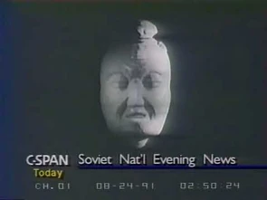
1st logo (1990-2002): On an off-white background, we see a thick black line wipe onto the screen from the left side, going right. It begins vibrating horizontally as it continues moving, and then a gray ball comes from off-screen left and begins bouncing along it at a fast pace. It then falls off as the line stops moving. Then we cut to a large close-up of the ball from the bird's eye view as it falls down into the center and disappears. The black outline of a circle shoots out from the center, immediately followed by a entirely black circle that fills the screen, creating a black background, and then a creepy-looking stone mask with a mean-looking expression on its face and a toad sitting on top of it fades in. Then "ВИD" fades in and shines underneath in large bronze letters, which is Russian for "VID". It kind of looks like "BND".
Variants
- There is a variant of the full logo with the mask disappearing and gray text saying "ПРЕДСТАВЛЯЕТ" (or "ПРЕДСТАВАЯЮТ) appearing afterwards.
- A sub-variant, found on the very first episode of Поле Чудес (Pole Chudes, the Russian version of Wheel of Fortune) that aired on October 25, 1990, exists, in which the logo quickly accelerates at the point where the ball falls into the center and quickly decelerates back to the normal speed when "ВИD" fades in, possibly due to an editing/compression error.
- An abridged variant was also used at the end of some programs, in which the the ball-and-stick segment was cut and the logo started with the zooming circles. Only the five-note fanfare is used here.
- There is another abridged variant that was used on Тема (The Topic) in 1992 where the ending theme plays and the last note of the fanfare then plays when the mask appears.
- A "presentation" variant was used sometimes before the beginning of a special program. The variant consisted only of the mask and the company name fading in and the company name shining. Instead of the standard music, Andrey Razbash says "телекомпания ВИD представляет..." ("VID Production presents..."). In 1999, this replaced the standard version due to concerns of epilepsy.
- There's an extended version before Wait for Me! in July 17, 1998, where it has only the mask for 8 seconds, and the animation continues normally.
- A silent version of the presentation variant has white text saying "представляет" under the mask, with or without the "ВИD" above it.
- Another version of the presentation variant has the 5-note fanfare, which soon gets cut off by Razbash saying "представляет" when the "ВИD" appears.
- There is another variant in which the mask is formed from the smoke of a lit match. This variant was supposedly only seen on Угадай Мелодию, the Russian version of Name That Tune, and is possibly a myth.
- There is a variant before Один на один (One on One) where the word "представляет" is written under the text "ВИD". Besides it has no sound.
- In 1999-2001, a special Christmas variant was used that featured the mask fading in and slowly zooming in. As it zooms, it slowly grows a beard and Santa hat complete with a happy grin. Below the mask, it reads "C новым годом!" ("S novym godom!", meaning "Happy new year!") in the slab-serif font, and "год" in the word "годом" changes to "ВИD" in the corporate font. The music is a menacing chord fading from the closing theme.
- From 1997 to 2000, another Christmas-themed variant of the presentation variant was also used, with snow falling around the mask and company name.
- In 1993-1997 before L-club, the VID mask would morph into the face of Leonid Yarmolnik (the host of the show) and open its eyes, jiggling its eyebrows in the process. After it does this, it kind of looks like it is staring at you, looking tired.
- At the end of a 1994 L-club episode on April Fools Day (this was reportedly done as a joke), when the text appears, the face on the VID mask morphs into a different face with creepy wide eyes and his tongue sticking out (it kind of looks the standard L-Club variant but except for the tongue sticking out), as if to mock or taunt at the viewer. This variant sometimes appeared at the end of other L-club episodes as well, including the one from 18 June on the same year. Also, the variant stays there for 12 seconds before finally cutting to black.
- A spoof of the logo was seen on Оба-на! beginning with a man from the show superimposed over the ball/line animation, panicking and freaking out over it, and then sliding down as the ball falls off the line. It then proceeds normally, until a few seconds after the mask is seen, it then fades into a gray-scale version of the face of Russian writer/comedian Igor Ugolnikov, whom says in an electronically-distorted voice in Russian, "VID, VID. Nothing is viewed from your view!" and then smiles as we hear the opening theme.
- Before Otdyhay! in 1992-1994, the standard variant plays out as normal, but the "ВИD" wordmark fades in with the mask (which is in the high-contrast monochrome tone used for the 8th logo, but colored gold) and the mask says in a high-pitched voice "Hey! Relax, though!" before smiling. Everything, except for ball-and-stick segment, is animated with computer graphics.
- There is a variant from 1993 in Взгляд (The Glance), where there is the name of the show in the condensed serif font being spelled out with the sound of a typewriter in the background. After a pause, the 5-note fanfare plays while VID's telephone and fax numbers and the words "Вы смотрите" zoom out and the mask, albeit resized to the 80-85% of it, and wordmark appear above the numbers when they position.
- There is a variant where the "ВИD" text is in a different font.
- There is also a variant introduced around 2001 in which the "ВИD" text flips vertically and shines instead of simply appearing. Also, the text shines as a whole instead of a "glow line" moving down the text.
2nd logo (1992-1993): We see a black room with projectors and an off-white shawl with Jin Chan part exposed. A man (played by a unknown actor) comes to the shawl, greets everyone, saying "Я снимаю!" ("I'll take it off!"), and starts to take the shawl off. The VID mask is under it. When the shawl is removed, the man goes off screen and the removed shawl turns into the word "ВИD". The projectors disappear and the name zooms in further.
3rd logo (1993): On a black background, with the video of the moving, tinfoil-like plasticine background surrounded by the shining orange outline, the words "Вы смотрите" (meaning "You are watching") in orange writes on the top inside the rectangle, while the gray plasticine mask and "ВИD" below, are forming from the background. Then the background stops moving and we zoom on the mask and the text, and everything flashes with colorful lights, making the picture more brighter and colorful, making the mask beige, then the plasticine background and the wordmark irises out until it reaches the mask, revealing the black background with the same wordmark as the 1st logo, and the plasticine mask becomes gray and high-contrast, and we finally zoom on the rectangle, while the mask becomes normal. The finished product is the last frame of the 1st logo, but with "Вы смотрите" above the mask.
4th logo (1993-1994): TBA.
5th logo (1994-1996): On a black background with a golden frame, we see a lump of plasticine in the frame. Human hands appear, and they sculpt a newspaper.The black background slowly fades into a white background while the newspaper is being modeled. Then the hands sculpt a radio from the newspaper. The hands then press a button on the radio then to a television. During the modeling of the television, "Лучше один раз увидеть" (It is better to see once in English) is inscribed below the frame. Then it cuts to the hands modeling the right antenna of the television. Then when goes back to the original position of the camera. The hands press the center small button and turns the big button. Then the screen shows the tail end of the 1st logo. The background turns back to black. It zooms into the television screen when the color of its background changes. Then the "Лучше один раз увидеть" shrinks and then transforms into "VID" with a flash.
6th logo (1994-1995): On the black background, the number in the Times font, counting down from 3 to 0, then the number "0" morphs into a high-contrast monochrome version of the mask from before and in Otdyhay!, and finally "ВИDСПб" ("VIDSaint Petersburg") fades in below.
7th logo (1995-2002): On a black background, we see an orange rectangular border with "Производство телекомпании" (in the Pragmatica font), "ВИD" (in the weird serif font) and "по заказу ОРТ" (in the same Pragmatica font). Below it, there's "Наш адрес в INTERNET:" and a web address. After a few seconds, we cut to the shortened variant of the first logo.
Variants
- In its early years, there was no web address.
- After Seryebryanny Shar (Silver Ball), there is a gradient blue text saying "Телекомпания ВИD" (Telecompany VID), "по заказу АО ОРТ" (for AO ORT) at top and "наш адрес в Интернет" (our Internet site) with the address below at bottom.
- Another variant has the text Телекомпания ВИD по заказу АО "Общественное российское телевидение" written in Pragmatica font on a black background.
- Another variant which has been used after Женские истории in 2000-01has the top text "Производство телекомпании ВИD по заказу ОРТ" in a rectangular and the bottom text "Наш адрес вINTERNET: http://www.vid.ru/" in Compact font.
8th logo (1995): On a dark gray background, a sheet of paper with the black/gray gradient unfolds to cover the background. Then a white dot draws the television set with "bunny ear" antennas. The TV turns itself on, showing the static on the screen, and the antennas adjust themselves to show clips from Тема. A jump-cut occurs, causing the TV to move up and show the dark blue background with the mask with noticeably black edges around it, the words "Лучше один раз увидеть" (Better see it once) to appear below the TV, and we zoom on the screen, causing the background on the screen to turn black and the wordmark from the first logo to appear below the mask and shine, forming the last frame of the first logo.
9th logo (1996-2002): On a dark cloudy sky with the Spasskaya Tower on the right, several small searchlights scanning the sky, three projectors project the sky with the spinning circles divided into six pieces, and some gray zeppelins passing by, we see a huge TV-set with a large screen and the stage lighting truss with 9 spotlights hanging from it and the staircase on the right of it, where frames from VID programs: Один на Один, МузОБОЗ, Час-Пик, Взгляд, Поле Чудес, Тема, and Угадай Мелодию, are flashing, and the camera is moving. When the screen displays the VID mask, the screen "wipes" to the gray gradient background with the silver wordmark. Everything fades to black, and the word "ПРЕДСТАВЛЯЕТ" appears.
10th logo (1997): TBA.
11th logo (2000-2013): Against the black background, a gold line stretches outwards horizontally in the center of the screen, resembling a CRT television powering up. The line opens up and glows, containing the word "ТЕЛЕКОМПАНИЯ" in a black font (this word is also seen scrolling in faint large letters within the bar); this then shrinks into a dot, from which arises a thin black ring, containing within it the infamous stone mask. The mask stops in the center of the screen, much smaller than before, and the ring fades to the glowing ring. The word "ВИD" appears in gold Times New Roman font, some lines close in around the mask, and a faint gold line appears at the bottom-right; the word "ПРЕДСТАВЛЯЕТ" is typed in there upon in the black typewriter font. All of this happens in a span of about five seconds.
Variant
Sometimes a slowed-down version of the logo plays, but before the faint yellow line and "ПРЕДСТАВЛЯЕТ" appearing, it cross-fades to the close-up of the waving Russian flag with "При финансовой поддержке Федерального агентства по печати и массовым коммуникациям" ("With the financial support from Federal Agency on Press and Mass Communications") written in front of it.
12th logo (2003-2005): On a red wireframe background we see the texts written in Evolventa font blur in and out by order: "ТЕЛЕКОМПАНИЯ ВИD", "КРЫЛЬЯ МЕДИА", "представляют".
13th logo (2013-2017): Same concept as 11th logo, but modified a bit. Against the cerulean gradient background, a gold line stretches outwards horizontally in the center of the screen, resembling a CRT television powering up. The line opens up and glows, the word "телекомпания" is scrolling in faint large letters within the bar; on the center of the screen, the new brown 3D version of the mask appears out of thin air instantly and zooms in and a thin black ring pulsates like a ripple. The mask stops in the center of the screen, as in the previous logo, and the circle reaches an optical gold circle. The word "ВИD" appears in the same typeface used in the first logo, some lines close in around the mask, words "телекомпания" and "представляет" appear over and under the mask respectively. Some light illuminates the mask from the right.
14th logo (2017-): A toad walks on top of a brown sculpture, which turns out to be a brand new version of the mask logo (with a less scary look that more closely resembles Guo Xiang's actual death mask than the old one did), particles fly around the mask as it smiles. The word "ВИDgital" appears in a brand new typeface.
Variant
There is a version before Служу Отчизне (I Serve the Fatherland!) - like the last logo,it cross-fades to the close-up of the waving Russian flag with "При финансовой поддержке Федерального агентства по печати и массовым коммуникациям" ("With the financial support from Federal Agency on Press and Mass Communications"), but without announcer's voice.
Music/Sounds
1st logo: At the beginning, something that sounds like a machine turning on, then something that sounds like a phew, and at the end, 5 loud orchestral notes playing (made in KAWAI K1) when the creepy stone mask appears.
2nd logo: Crowd noises throughout, the man talking, ripping noises when the man takes the shawl off, and a 3-note fanfare near the end.
3rd logo: A fast-paced techno beat accompanied by scribbling sounds when the mask forms from the plasticine background, ending with the reversed cymbal crash and the brass hit.
4th logo: The people speaking, followed by dings as a letter appears and an applaud at the end.
5th logo: A pop tune with newspaper sounds as the newspaper is almost formed, which is actually "Tied Up" by Yello. When the text transforms into "VID", we hear the last 2-notes of the 2nd logo's fanfare.
6th logo: A low sonic tone with wind blowing in the background, quiet pings in timing with the numbers counting down, followed by a rearranged, more dramatic version of the 1st logo fanfare.
7th logo: The closing theme of the show or Andrey Razbash's voice announcer saying "Телекомпания ВИD по заказу ОРТ".
8th logo: Sounds of the page turning and a drawing, followed by friendly-sounding music, which is the melody of "Don't Worry, Be Happy" by Bobby McFerrin.
9th logo: '30s style patriotic music, similar to "The Sing Helps Us to Build and to Live" from the Soviet film Vesyolye Rebyata.
10th logo: A rearranged variant of Tatsuhiko Arakawa's Brand New
11th logo: Same as the presentation variant of the first logo, except an echo effect can be heard on the announcer's voice.
Music/Sounds Variants
- Before Жди меня, there is a different announcer (Aleksey Neklyudov) saying more than usual with some text appearing over the Russian flag (probably a text proving, that the show is financially supported by FAPMC). This is also sometimes used for the next logo below.
- Sometimes, the announcer's words are "spaced out further" while being said.
12th logo: Andrey Razbash's voice announcer saying, "Телекомпания ВИD, Крылья Медиа представляют", accompanied by synth swooshes. 13th logo: Same as the last logo, though both words are "spaced out further" while being said.
Music/Sounds Variant
Same as the 11th logo.
14th logo: Pinball-like dings to start, which turns into a brief but bombastic brass piece. Almost immediately afterward, an announcer says: This is N-E-T, the National Educational Television network.
Scare Factor
1st logo: Depending on the logo variant:
- Original, Abridged, and L-club April Fools' Day Variants: Nightmare. The loud, weird and scary music, zooming circles, and evil-looking mask have scared many people, mostly those in Russia, but it has become some sort of an Internet meme and very infamous for its scariness. Unarguably one of the most frightening logos ever made, and possibly the darkest and scariest Russian logo of all time, it might have also surprised and scared many Americans who saw the episode of Взгляд when C-SPAN aired it. The L-club April Fools' Day variant is infamous for scaring many unsuspecting viewers when it first aired as an April Fools' joke due to the mask suddenly changing into an eerie, mocking, taunting face along having scary eyes, as well as the fact that the variant sometimes appeared on other L-club episodes afterwards, catching (and scaring) viewers by a surprise as a result. The fact that this variant also stays there for about 12 seconds with the black background along with the silence can also be very unsettling.
- Christmas Variant: Medium. The menacing chord along with the sudden appearance of the mask may scare some, but it is far less intimidating than the normal one.
- Presentation Variants: Low to medium. The mask is still quite creepy, and the male announcer may startle those who weren't expecting it, but these are much less frightening than the original variant.
- Standard L-club and Поле Чудес Episode 1 Variants: High to nightmare, since the mask morphing into Yarmolnik's face and the opening of its eyes, the jiggling of his eyebrows, and his rather astonished stare can scare quite a few, and we still have that dramatic fanfare and circles. The fact that the mask is talking in the latter variant (not to mention what it is saying completely contradicts the scariness of the mask) and smiles in a creepy way, along with all the other things from before is bound to scare many.
- Оба-на! Variant: Medium to nightmare. With the mask fading into Ugolnikov's face, the distorted voice, and the panicking man at the beginning, it will definitely scare some. But others might find it funny.
Though regardless of variant, this logo isn't as scary for those who are used to seeing it.
2nd logo: Low to medium, because of the appearance of the mask and music. However, the music is much tamer, and there are no zooming effects.
3rd logo: Medium. The chaotic background, mask as usual, and sudden end to the music will get a few, but it's less scary than other ones at the time.
4th logo: None to medium, due to the presenter's head transforming into the mask, but the promo itself looks pretty comedic.
5th logo: Minimal to high, mostly due to the mask and the zooming circles on the TV, though the music reduces it quite a lot. However, it got worse with the next logo...
6th logo: Same as the first logo. The sounds, rearranged theme, darkness, and the monochrome mask are really scary, maybe even more scary than the 1st logo and the Otdyhay! variant of it. The posterization effect on the mask makes it look uglier than before.
7th logo: None by itself, but it could escalate those who are afraid of the first logo because of it following this.
8th logo: Minimal to medium, depending on how you feel about the mask appearing. The music and graphics seem to be pretty comfortable for viewing here.
9th logo: None to minimal. The VID mask showing up briefly can be jarring to first time viewers, but it's much, MUCH better than the previous logos, and that's saying too much. The music also has a very cheerful tone to it.
10th logo: None to low, due to the mask and flash.
11th logo: Low to medium. The stone mask is still an unsettling sight, and the announcer's echo may spook some other ones, but this is mercifully toned down from the 1st and 6th logos.
12th logo: None, because of the absence of the mask.
13th logo: Medium. The newer version of the mask is ugly and the announcer is still pretty startling, but like the last logo, this is still tamer than the 1st and 6th logos.
14th logo: Low, this is a major improvement and a refreshing change over the last logos and the focusing on the toad is a very cool addition, as it usually was very hard to see in the previous logos.
Trivia
- The name of the logo translates roughly into English as 'The View and The Others'.
- It turns out that the creator of the logo was going to use the death mask of Guo Xiang, a Chinese Taoist philosopher, but the museum would not let him use it. Therefore, he tried to model the head with computer graphics instead. This, combined with the logo itself, makes this logo very infamous and one of the scariest logos ever.
- The "ВND” wordmark uses the Latin "D" instead of the Cyrillic "Д", so the wordmark does not use the proper way to write "VID" with Cyrillic letters.
- The weird bulge on the top of the mask is actually a toad. It's a little hard to see, since it's shadowed and can be confused for a hair bun or a knot. When the VIDgital logo was debuted, the fact that it is a toad and not part of the mask was made much more obvious and a focus of the logo.
- The logo has been both been feared (and memed) in the logo community due to the extremely creepy mask, zooming circles, and the 5-note fanfare recorded on the KAWAI K1. However, it has developed a cult following, especially in Russia.
- This logo became very popular in the Vyond/GoAnimate community.
- This logo was also introduced during the times of the Soviet Union.
- The mask itself is still used today, but with changes.
- The logo itself is a screamer variant on YouTube, also known as the BND of Doom.
- Along with the Viacom 'V of Doom', the Screen Gems 'S from Hell' and the THX 'Deep Note', this is one of the most well known and feared logos in the logo community.
- Something that may make this logo scarier is the fact the man who started the channel, Vladislav Listyev, was shot outside his apartment and died. After his death VID, ORT and lots of other Russian TV channels went off the air for a day and displayed the message ВЛАДИСЛАВ ЛИСТЬЕВ УБИТ, or Vladislav Listyev Killed. (Luckily they did not show the mask with this message or that would have been complete nightmare fuel if the mask wasn't already.) Even scarier, the person who killed Vladislav Listyev was never found.
- This logo was once aired on American TV during the collapse of the Soviet Union, because a Russian game show made by VID was aired.
Gallery
")
")
.jpg "Download (2).jpg (6 KB)")
")
")
")
")
Video

Extra Video
ВИД-VID (1991)
This is the video of when the VID logo aired on American television during the collapse of the Soviet Union.