Scary Logos Wiki
Advertisement

Cannell using his typewriter.

Logos[]

In the early years of Stephen J. Cannell Productions, they had a simple in-credit logo with the text “A STEPHEN J. CANNELL PRODUCTION.” It would occasionally include a copyright stamp on the bottom. It was only used between 1976 and 1982, but it’s a nice callback to simpler times.[]

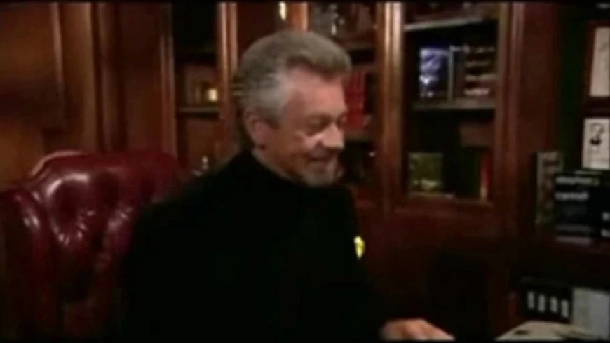
One of the best production logos has to be the Stephen J. Cannell Productions logo. It begins with Stephen J. Cannell typing on an IBM Selectric typewriter in a study surrounded by bookshelves and awards. The camera moves around him as he grabs the paper from the typewriter and throws it into the air. The scene then fades to a black background, and the paper is animated as it floats down toward a stack of papers. The text "Stephen J. Cannell Productions," "Stephen J. Cannell Productions, Inc.," "A Stephen J. Cannell Production," and "Cannell Entertainment, Inc." appears above the stack. And, depending on the logo, there are several different outfits that Cannell wears. It was only used from 1981 to 1999, but it’s a classic and will always be remembered.[]

1981[]

Cannell 1981

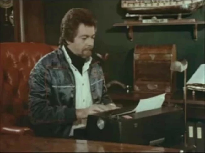
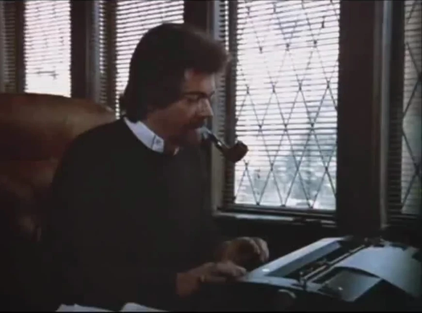
I am a big fan of the Stephen J. Cannell Productions logo, and I’m excited to see some of the variations it has gone through over the years. The earliest version of the logo features Stephen J. Cannell in his office, typing on an IBM Selectric typewriter. He is wearing a dark colored sweater with a white collar shirt, and he is smoking his pipe. I believe the pipe is a nice touch, and it really sets the tone for the logo. I’m glad to see that the logo has remained mostly the same over the years, as it is truly a classic.

The earliest variant of the Stephen J. Cannell Productions logo features the man himself in his office, hard at work typing on an IBM Selectric typewriter. At the time, Cannell wore a dark colored sweater with a white collar shirt and was smoking his pipe. This logo was featured in shows including The Greatest American Hero, Season 1 of The A-Team, and early Season 2 episodes. It was only used between 1981 and 1982, but it’s a fun reminder of a simpler time.

1983[]

Cannell 1983

One of my favorite versions of the Stephen J. Cannell Productions logo features Stephen J. Cannell wearing a blue jean jacket, white flannel shirt, and black turtleneck while smoking his pipe. It's the last time that Cannell appears with his signature pipe in the opening sequence, as he quit smoking in 1984. This logo variant is from 1983.

Stephen J. Cannell Productions has had many iterations of their logo over the years, but the most memorable one is the one that begins with Stephen J. Cannell himself typing on an IBM Selectric typewriter. The 1983 iteration of this logo is one of the most eye-catching, with Cannell wearing a blue jean jacket, white flannel shirt, and a black turtleneck while smoking his pipe. This was the last time Cannell appeared with a pipe in this opening sequence, as he gave up smoking in 1984.

1984[]

Cannell 1984

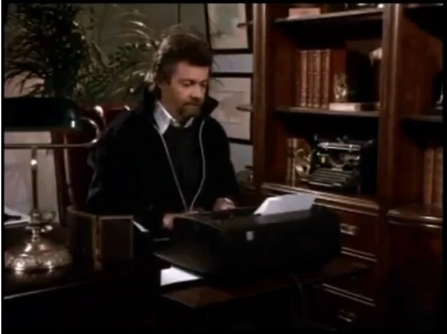
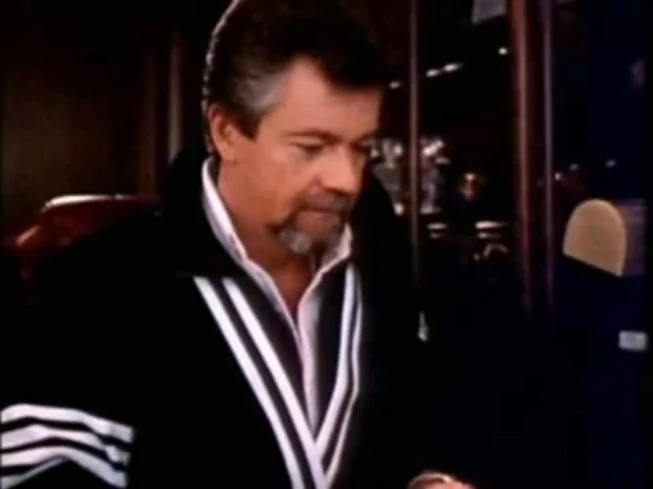
I’m watching this fun Stephen J. Cannell Productions logo from 1984, and I noticed a big change from previous versions. Stephen J. Cannell is still working hard at his typewriter, but now he’s wearing a black jacket and dark sweater over a white collar shirt. Most importantly, the pipe is gone! This makes sense, since Cannell gave up smoking in 1984. You can see this logo on the early third season episodes of The A-Team.

I’m watching this fun Stephen J. Cannell Productions logo from 1984, and I noticed a big change from previous versions. Stephen J. Cannell is still working hard at his typewriter, but now he’s wearing a black jacket and dark sweater over a white collar shirt. Most importantly, the pipe is gone! This makes sense, since Cannell gave up smoking in 1984. You can see this logo on the early third season episodes of The A-Team.

1985[]

Cannell 1985

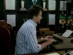
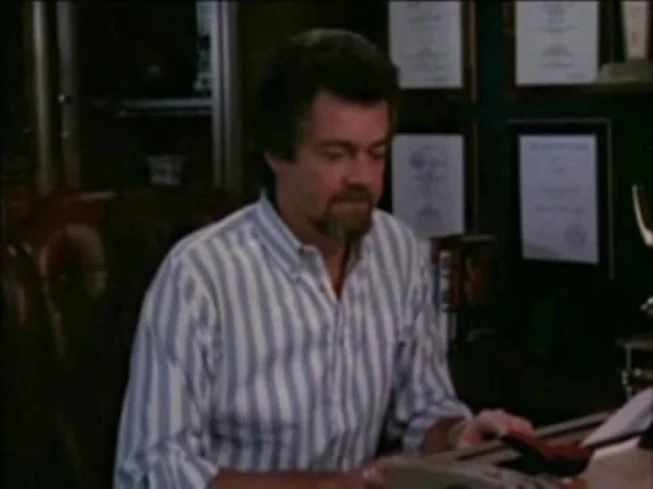
Stephen J. Cannell’s office changed again in 1985, and the awards were added to the office. Cannell also sports a new look, wearing a white and gray striped flannel shirt. This logo appeared in later episodes of Season 3 ([#########]) and the last two seasons of The A-Team, such as Season 4 ([#########]), and Season 5 ([#########]).

In 1985, Stephen J. Cannell’s office changed again, and the awards were added to the office. Cannell also sports a new look, wearing a white and gray striped flannel shirt. This logo appeared in later episodes of Season 3 (1984-1985), and the last two seasons of The A-Team, such as Season 4 (1985-1986), and Season 5 (1986-1987).

1987[]

Cannell 1987

Stephen J. Cannell Productions’ logo has changed a lot over the years, but its main features have remained consistent. In 1987, Cannell changed his office again, this time sporting a casual black and white vest. For such a well-known and memorable logo, it’s fun to see how the details changed.

Stephen J. Cannell Productions’ logo has changed a lot over the years, but its main features have remained consistent. In 1987, Cannell changed his office again, this time sporting a casual black and white vest. For such a well-known and memorable logo, it’s fun to see how the details changed.

1989[]

Cannell 1989

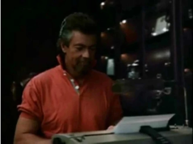
The Stephen J. Cannell Productions logo underwent many changes over the years, but one of the most memorable versions is the one with Stephen J. Cannell himself at his typewriter. In the 1989 version of this logo, Cannell wears a red polo shirt with the collar up.

Stephen J. Cannell’s office changed again in 1989, and you can see him wearing a red polo shirt with the collar up. The awards are also included in the office now. This logo appeared in later episodes of Season 3 ([#########]), and the last two seasons of The A-Team, such as Season 4 ([#########]), and Season 5 ([#########]).

1996[]

Cannell 1996

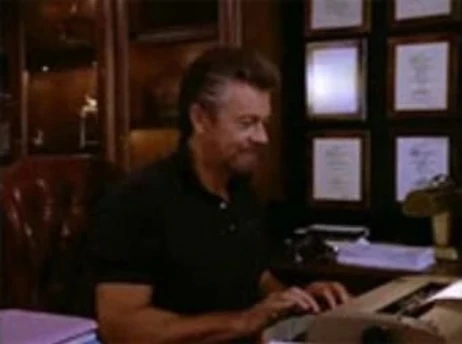
Do you know what Cannell was wearing in the 1996 Stephen J. Cannell Productions logo? In the 1996 version, Cannell wore a black polo shirt.

In 1996, Cannell's office changed again, and he started wearing a black polo shirt. This is one of many updates that have taken place throughout the years. The concept and animation have remained the same, but the main difference is the clothes that Cannell wears. There are even scenes where he wears different outfits, possibly awards in the office added as well, and even different offices were used.

2004[]

Cannell 2000

Stephen J. Cannell’s office changed again in 2004. This time, he’s rocking a black jacket and a black turtleneck. Of course, this is just one of many updates that have taken place throughout the years. The concept and animation have remained the same, but the main difference is the clothes that Cannell wears. There are even scenes where he wears different outfits, possibly awards in the office added as well, and even different offices were used.

I’m watching the Stephen J. Cannell Productions logo again. Do you know what Cannell was wearing in the 2004 version? In 2004, his office changed again, and Stephen J. Cannell wore a black jacket with a black turtleneck. I love seeing how the details change over time!

Variants:[]

  • In the early years of Stephen J. Cannell Productions, there was a relatively simple logo with the text “A STEPHEN J. CANNELL PRODUCTION.” Sometimes it would include a copyright stamp on the bottom. It was only used between 1976 and 1982, but it’s a nice callback to simpler times. One of the best production logos has to be the Stephen J. Cannell Productions logo. It begins with Stephen J. Cannell typing on an IBM Selectric typewriter in a study surrounded by bookshelves and awards. The camera moves around him as he grabs the paper from the typewriter and throws it into the air. The scene then fades to a black background, and the paper is animated as it floats down toward a stack of papers. The text "Stephen J. Cannell Productions," "Stephen J. Cannell Productions, Inc.," "A Stephen J. Cannell Production," and "Cannell Entertainment, Inc." appears above the stack. In the early version, Cannell types at the typewriter from the front, the camera does not pan clockwise, he throws the paper up into the air, and the animation sequence continues as normal. There were no awards in the office, and Cannell smokes his pipe while typing on the typewriter.
  • One of the most interesting Stephen J. Cannell Productions logo variations is the one seen on some episodes of Silk Stalkings and Renegade in the early 1990s. After Cannell tosses the paper, the animation cuts awkwardly to a black screen, and the 20th Century Fox Television ID, Cannell's parent company, follows. In another version, everything is the same, except Cannell gently tosses the paper instead of throwing it up into the air. It's a fun little change that gives us a glimpse into the creative process behind these classic TV logos.
  • Of course, the Stephen J. Cannell Productions logo was updated often over the years, but there was one major constant throughout the changes: Stephen J. Cannell himself. Cannell’s office might change, he might be wearing a different outfit, and there might even be more awards in the background, but Cannell is always the one typing away on his IBM Selectric typewriter. and even different offices were used. The concept was always the same, as well as the animation. A list of outfits can be seen above.
  • On Renegade's fourth and fifth seasons, there's a quirky detail in the logo. "Stephen J. Cannell Productions" is replaced by "Renegade IV Enterprises," but the rest of the sequence is the same. While I know this is primarily a logo wiki, I think it's a fun little fact that's worth mentioning.
  • I stumbled on something interesting the other day, and I couldn’t resist sharing it. From 1991 to 1993, Stephen J. Cannell Productions was referred to as “Stephen J. Cannell Productions, Inc.” I always thought the company had a cool name, but adding the “Inc.” made it sound even more professional and successful.
  • Did you know that there was a variation on the Stephen J. Cannell Productions logo for a few years? It’s the same 1989 version but from 1991 to 1996, the logo would fade to black after Cannell pulled the paper out of the typewriter. Then the words “Cannell Entertainment Inc.” would appear in the Gill Sans font. The syndicated version would also have the words “Distributed By” above the company name. It’s amazing how many details go into these production logos.
  • I discovered there’s a sped-up version of the 1985 and 1987 Stephen J. Cannell Productions logos. The fast camera movement matches the two short 1987 logo themes that were featured on early to later season two episodes of 21 Jump Street, starting with the episode "Besieged: Part 2." I'm not sure why they decided to speed up the logo for this particular show and these specific episodes, but I think it's a fun and creative way to mix things up. It's also interesting to see how the same logo can be presented in different ways to create different effects.
  • The Stephen J. Cannell Productions logo has seen many iterations over the years, and one of the most interesting is the short version that features only the last half of the animation. This version was used on The Commish and the 1994 TV movie A Place for Annie. I’m curious to know more about the reason behind this change. Was it a creative decision? A cost-cutting measure? Whatever the reason, it’s an interesting variation on a classic logo.
  • I was watching an episode of Caesar's Challenge and noticed something different in the opening credits. In the pilot episode and some of the early episodes, the Stephen J. Cannell Productions logo appears as an in-credit logo. This is a unique variation that I hadn't seen before, and it made me wonder if there were other episodes that used this still variant. I'd be interested to know more about the reason behind this change and whether there is any significance to it.
  • I was watching the Stephen J. Cannell Productions logo on an episode of Riptide, and I noticed something unusual. In season 3, episode 21, "Home for Christmas," the logo appears as a still image, skipping the usual animation. It's a unique variation that I haven't seen before. It made me wonder if there were other episodes that used this still variant. I'm curious to know more about the reason behind this change.
  • I stumbled on something interesting the other day, and I couldn't resist sharing it. In a RTL9 airing of Hardcastle and McCormick Season 3, Episode 21, "A Chip Off the Ol' Mit," there's something quirky about the opening credits. Apparently, the credits were time-compressed, which sped up the Stephen J. Cannell Productions logo. To top it off, the closing music played over it. It's a funny little anomaly that caught my attention and gave me a chuckle.
  • This tribute logo for Stephen J. Cannell is a beautiful and touching tribute to a great man. I was particularly struck by the way the text "STEPHEN J. CANNELL" and "COLLEAGUE, MENTOR, FRIEND" fades in above and below Cannell as he types. It's a simple yet elegant way to honor his memory. The logo is a fitting tribute to Cannell, and I'm glad that his legacy will continue to live on through his work.

Stephen J. Cannell Productions has had a lot of different logos over the years, and the “Cannell Studios” logo is one of my favorites. It has a 3D “silvery” “C” with the text “THE CANNELL STUDIOS” in Times New Roman font. The text starts out tilted at a 90-degree angle and does a 90-degree turn to face us, while the “C” takes its position below the Cannell text. Then the “C” quickly flashes, and everything turns 2D. A copyright notice for Stephen J. Cannell Productions, Inc. fades in below the logo.[]

Music/Sounds Variants[]

  • Do you recognize this variant of the Stephen J. Cannell Productions logo? Starting with The Greatest American Hero season two, episode "The Two-Hundred-Mile-an-Hour Fastball," there is a rare version of the logo that has a xylophone, violins, and a very different four-note guitar ending theme. It sounds a little bit like the theme song for the show. It was only used for a short time and is pretty difficult to find.
  • There are several variations of the Stephen J. Cannell Productions logo, but my favorite is the one with the November 25, 1981-February 8, 1983 fanfare. It starts with a three-note horn fanfare, followed by a rousing orchestra and six notes played by a guitar. All of the notes work together to create a dramatic tune that really sets the tone for the show. It’s the perfect way to introduce a TV show and get the audience excited about what’s to come.
  • On September 27, 1987, a rearranged version of the 1981 Stephen J. Cannell Productions theme went out of use. I miss the violins playing while the familiar six-note theme plays. It sounds much more dramatic than the 1981 theme. It's a shame they got rid of it so soon, but I'm glad I got to hear it on the 21 Jump Street season 2 episode "Besieged: Part 1".
  • The Stephen J. Cannell Productions logo has had several iterations, but there is one I’m particularly curious about. From January 4, 1985 to September 24, 1987, the logo featured a combination of the first half of the November 1981 Cannell logo theme from The Greatest American Hero Season 2 and the much more dramatic second half of the original 1981 logo theme. I’m wondering what the reason was behind this change and if it had anything to do with the nature of the shows that used it, like Hunter and Wiseguy, which were both crime dramas.
  • Did you know there are two different versions of the Stephen J. Cannell Productions theme song? A short version plays on 21 Jump Street, and the full version plays on Hunter. The short version, which is my favorite, includes a Malibu-style guitar playing the first three notes, followed by a dramatic fourth note and the remaining six-note theme. This theme was first used in 1987 on the Hunter Season 4 episode "Not Just Another John Doe." It continued to play on both Hunter and 21 Jump Street until 1990.
  • The Stephen J. Cannell Productions logo had a variant that featured a musical composition played by a piano, guitar, bells, and an orchestra all at the same time. There was also a flute sound that preceded the rousing music, and later a guitar that played the last notes of the theme. It was used in “Hunter” season four, among other places. This variant has a short version, seen on an episode of “21 Jump Street,” and another version with only the last half of the music, seen on “Profit.”

This is a pretty dramatic tune for a production logo. The synthesizer seems to do all of the heavy lifting here. It establishes the tone, sets the mood, and is really the only instrument playing throughout. It’s very suspenseful, and gives the Stephen J. Cannell Productions logo a distinct sound. The synthesizer starts off with a simple melody, but then adds some complexity with countermelodies and some quick arpeggios. This logo is quite a bit different than the previous one and is much closer to something you would hear on a horror show. It creates an exciting and tense atmosphere that feels like something big is about to happen.

Scare Factor[]

It’s interesting that the first Stephen J. Cannell Productions logo was just text. I guess you could say they were keeping it simple in the early days. It’s funny how much logos have changed over the years, and now it’s hard to imagine a production company without some kind of visual element in their logo. This one was just text with a copyright stamp sometimes, but it’s a reminder of how things used to be.

In the 1981 version of the Stephen J. Cannell Productions logo, Stephen J. Cannell is in his office typing on an IBM Selectric typewriter. He is wearing a dark-colored sweater with a white collar shirt and is smoking a pipe. He then grabs the paper from the typewriter, throws it up into the air, and the scene then fades to a black background with the paper animated as it floats down toward a stack of papers. The text "Stephen J. Cannell Productions," "Stephen J. Cannell Productions, Inc.," "A Stephen J. Cannell Production," and "Cannell Entertainment, Inc." appear above the stack.

Then in 1983, Stephen J. Cannell wears a blue jean jacket, white flannel shirt, and black turtleneck while smoking his pipe, and then in 1984, he wears a black jacket and dark sweater over a white collar shirt with no pipe. In 1985, Cannell sports a new look with a white and gray striped flannel shirt, and his office now has awards in it. In 1987, he has a black and white vest, and in 1989 he wears a red polo shirt with his collar up. In 1996, he’s back to wearing a polo shirt, this time in black. Finally, in 2004, he’s rocking a black jacket and a black turtleneck.

  • The Stephen J. Cannell Productions logo has many variants, each of which has its own distinct features. But the original variant is the most popular, despite it being a bit too loud for some people. The 1981 logo shows Stephen J. Cannell in his office, typing away on an IBM typewriter. The shot then widens to show his typewriter in the foreground, and Stephen tossing the page up into the air. This logo is well known for its dramatic music. The startling music combined with the sudden shift in the camera angle can make this logo scary for those who aren't prepared for it.
  • The Stephen J. Cannell Productions logo has seen many variations over the years, but some versions are more disturbing than others. The 1981 logo is by far the most unsettling, due to the eerie and disorienting music. In contrast, there is another variation where Stephen J. Cannell himself does not appear, and the music is considerably more tame. This version doesn’t have the same unsettling feeling, but the paper being tossed may still put some off.
  • Stephen J. Cannell was an amazing producer, and I really miss him. I love watching the Stephen J. Cannell Productions logo to remember him by. It’s so cool to see him in his office working hard on his Selectric typewriter. I also like to see the evolution of his attire through the years. It’s a shame he’s not around anymore, but it’s nice to have a tribute to him like this.

The logo for Stephen J. Cannell Productions is so memorable and so many people’s favorite. It begins with Stephen J. Cannell typing on an IBM Selectric typewriter, then fades to black. Then the paper from his typewriter is animated as it floats down toward a stack of papers. The text "Stephen J. Cannell Productions," "Stephen J. Cannell Productions, Inc.," "A Stephen J. Cannell Production," and "Cannell Entertainment, Inc." appears above the stack, depending on the logo. The logo is creative and fun, and it also makes me appreciate the effort and artistry that goes into production logos.

I think the Stephen J. Cannell Productions logo from 1991 to 1994 is underrated. It’s simple, but it effectively showcases the company’s name with a quick zoom-out animation. Some might find this jarring and prefer the more detailed versions of the logo, but I think that simplicity is a virtue. It gets the message across clearly and doesn’t overstay its welcome. Also, the low-key synth music is a nice touch that gives the logo a retro-futuristic feel. Overall, I think it’s a solid logo that deserves more appreciation.

Advertisement