(Adding categories) Tag: categoryselect |
(Adding categories) Tag: categoryselect |
||
| Line 25: | Line 25: | ||
[[Category:1986]] |
[[Category:1986]] |
||
[[Category:Taken From "Hey Arnold!"]] |
[[Category:Taken From "Hey Arnold!"]] |
||
| + | [[Category:Nicktoons]] |
||
Revision as of 19:20, 10 June 2016

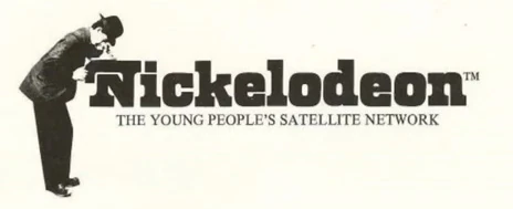
In 1979 the network's first logo showed a man in a bowler hat looking into a Nickelodeon machine. New York based creative director/designer, Joseph Iozzi, designed the first Nickelodeon logo. He also named the channel and created all the advertising. The first model ever used in a Nickelodeon advertisement was the designers son, Joseph Iozzi II. The font used in the logo was designed by Lubalin, Smith, Carnase, Inc. The intent of Iozzi was to replace the graphic of the line illustration of the man peering into the Nickelodeon with a period illustration of a boy in nickers, British flat cap, big suspenders, tip toed on a stylish iron train step looking into the Nickelodeon font. Available time and new management never permitted the planned redesign.The Logo in 1979 is Very Scary for Kids.
Sponge Out Of Water Logo
Scare Rank: Low: The giant metal nickelodeon font and the loud splash could get to some.