Background[]
Viacom Productions (or simply Viacom, otherwise known as the V of doom) was the production company of CBS. The company formed from CBS Films (1952-1970). There first name was "CBS Television Film Sales." In 2006, they split up with CBS, forming Viacom Inc., and later re-merged in 2019 to form ViacomCBS.
Fun Fact: "Viacom" is derived from the company's full name, "Video & Audio Communications."
Logos[]
Viacom International[]
1st logo (1971-1976)[]
The word "ViACOM" in white, a group of letters at a time (in an ascending number: "V" (1), "iA" (2) and "COM" (3)), slide in from the right, with the background changing color as each one stops. As the screen fades to purple, the letter "V" slides in. Then "iA" slides in, changing the background to green. Then "COM" slides in, changing the background to red. When the word "ViACOM" is formed, the camera quickly pans outward and the words "A" and "PRESENTATiON" are seen to the left and right of the word "ViACOM", over a blue background. The logo is actually in the same font as The Mary Tyler Moore Show logo (called "Peignot").
2nd logo (1976-1986)[]
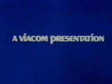
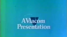
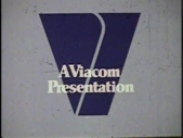
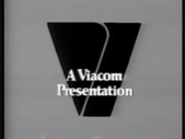
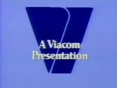
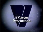
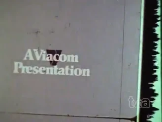
On a sky blue (or lavender) background, the text "A Viacom Presentation" in a Palatino-like typeface zooms-in from the center of the screen at a very fast pace, then stops abruptly (on the filmed variant) when it gets near to the screen. Then, a fancy-cut, navy blue "V" (a downward trapezoid with a curved line in the near center) comes from the center and moves gradually closer and closer to the screen. When it gets to the point where the "V" takes up nearly the entire screen, the screen suddenly cuts to black or fades to black (depending on the version of the logo), with the "V" presumably still moving ever closer.
Variants[]
- A network television version exists from 1979 until 1985, consisting of the black "V" with the white text "Viacom" underneath, with a sea green/dark blue background.
- Usually, the black "V" and the name "Viacom" zoom-in together and stop smoothly once it has come to a huge size.
- Sometimes, the "V" slides-in from the left with "Viacom" sliding-in from the right.
- A variation of the network version features a copyright stamp for "Viacom International" appearing at the bottom once the "V" stopped to zoom almost completely.
- A network television variation with a mirrored "V" has also been spotted, where the logo flips up.
- A still version of the network version exists.
- In the videotaped variants, the words "A" and "Viacom" spaced farther apart, the text has a slightly noticeable drop shadow (as opposed to being completely flat), and the animation is more smooth. This was used from 1978 to 1986. Color variants include monochrome, purple background with dark blue "V", and faint purple with blue "V", among others.
- Some filmed variants feature the "V" actually stopping right before it cuts to black. This was largely common in its earlier years (especially in black & white variants).
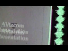
- There's a variant where the videotape was infected by the infamous vinegar syndrome (not to be confused with the DVD/Blu-Ray company).
- A YouTube variant exists where the logo is in black-and-white, warped, and on a filmstrip. The filmstrip slips to the right as it is pushed through a film gate (which is off-screen) and disappears, taking the logo with it.
3rd logo (1981)[]
On a black background, there is the "V" rotating to the center in a rainbow streak. Then, the rainbow streak lines out of the logo. After that, the "V" flashes to bright cerulean and the word "Viacom" in the same color flashes in with the word "presents" below. As the opening theme comes up, they zoom up to the left corner of the "V" step-by-step until it engulfs the screen with blue. At the end of the reel, there is the "V" with the word "Viacom" in blue and the word "from" above the "V" and they all zoom in towards the viewer.
4th logo (1984-1986)[]
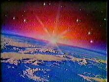
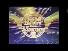
It starts off in outer space. The words "Special" and "Delivery" streaks through the sun that is in the background leaving a rainbow trail. Then on a blue/black gradient background, the two words fly to a ring with wings. "From Viacom" with "Viacom" bigger, are also in this logo above the familiar "V" from the 2nd logo. The logo then constantly shines throughout the logo, with it occasionally flashing. At the end, a firework flash effect emerges from the logo.
5th logo (1985-1987)[]
On a black background, there is a still image of the Viacom "V" logo in blue. Below that is the "Viacom" name in white.
6th logo (1985-1986)[]
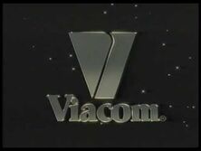
- Opening: Against a space background with twinkling stars, a metallic steel outline of the Viacom "V" and "Viacom" in its familiar Palatino like font zoom back with a metallic steel trail effect. The trail effect finishes as the "V" turns solid and metallic textured and "Viacom" turns solid gray. The logo shines in a similar manner as the "Special Delivery" logo before flying downwards and offscreen.
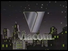
- Closing: Against a city skyline with a purple night sky with most of the building's lights switched on and twinkling stars, the metallic textured "V" forms out of light particles. The word "Viacom" forms in the same manner as before. The logo shines once completed.
7th logo (1986-1990)[]
It starts out with a screen, divided half black/purple gradient on top and half silver on the bottom with a bright light flare shining between. The silver part then rotates counter-clockwise (a la CBS/Fox Video), revealing it is a steel version of the "V" logo as the background changes to a black/blue/purple gradient. The word "Viacom" flies in from the upper-left of the screen and places itself under the "V", and the "V" shines. Sometimes, the "V" shines three or four times. There is also a warp speed and ultra warp speed version of the standard (one wipe) and the four wipes version.
Variants[]
- VHS tapes containing this logo and select TV broadcasts have the "V" shining three times.
- A warp speed version of the three shines variant has been seen on the syndicated version of Super Sloppy Double Dare.
- There is also a variant where the "V" shines four times. It has been seen on episodes of Rawhide, Perry Mason, Matlock (seasons 1-4), Hogan's Heroes, The Adventures of the Little Koala, Finders Keepers (Toffler version), Easy Street (1986 series), and the 1986 revival of Split Second. There is also a warp speed version of this, as well as a rare ultra warp speed variant.
- There is a still variant.
- There is a variant where the "V" doesn't shine at all. It was only seen on We Love Lucy; the 30-minute re-edit of The Lucy-Desi Comedy Hour.
- On the 1987 Celebrity Double Dare pilot, the logo is revealed with a computer-generated effect before animating.
- There is also a B&W variant.
- There is another sped-up variant of this logo with the music at the normal speed.
- There is also a variant that plays at a slightly slower speed.
- On Fox's Family Double Dare, the logo fades in after the Nickelodeon logo with the "V" is already in place, then the "V" shines two times before fading out.
- There is a variant where both the "V" and the word "Viacom" appear to be in higher contrast, making the logo look shinier than before.
- One version had a midnight blue screen with text saying "DISTRIBUTED BY", and then after a second, it cut to the "V" in the middle of its animation, with the full music playing throughout.
- Another version cuts to when the "V" turns. This is unofficially known as the "in-progress" variant.
- There is a variant where the logo starts off in black and white, but quickly changes to color. This was spotted on a 1988 rerun of The Andy Griffith Show on TBS.
- The British Braveworld Video VHS of King Creole has a variant that cuts off the first or so second from the logo.
- On an episode of The Life and Times of Grizzly Adams on GetTV, the logo starts fading during the second time it shines.
8th logo (1990-2000)[]
On a shaded blue background, a silver "V" flies from the bottom left and then backwards. As it does so, a zig-zag line comes out of it to form the other letters in the name (it shines as it does this), with the "A" and "M" still taking the form of zig-zags, forming the word, "VIACOM". The completed logo, which kind of looks like "\/|/\CO/\/\", shines. On network TV productions from 1998-2006, we see the "VIACOM" text already formed, but a line slides in from the right and forms into "PRODUCTIONS" in Futura Extra Bold font, after which the "C" and the "O" in "VIACOM" shine.
Variants[]
- There is a very rare 16mm filmed variant seen on some TV movies from the era.
- Several shows would have the name already formed during the later years, with the only animation being the shining of the letters.
- There is a text variation on this logo for Viacom Productions. It has the "VIACOM" text already formed, but a line slides in from the right and forms into "PRODUCTIONS" in Futura Extra Bold font, after which the "C" and the "O" in "VIACOM" shine. This shorter variation was seen on network TV productions from 1998-2003. There was another variant of this in which the text doesn't shine at all, used on Diagnosis: Murder.
- On reruns of the Sabrina, the Teenage Witch pilot on ABC Family (now Freeform), The Hub (now Discovery Family) and Antenna TV, this logo is still (a la the 1985 "V of Happiness" logo) and followed by the 2003 Paramount Domestic Television logo.
- A black & white version of this exists on some prints of older B&W shows (though most feature the color version).
- On the 1997 TV movie, The Right Connections, the words "in association with" are seen over the logo's background, then fades out when the animation starts. It was also spotted on another TV movie, In the Doghouse (1998), as well as the short-lived UPN series from 1995, Deadly Games.
- On WPIX's print of the Honeymooners episode "The Sleepwalker", the logo freezes before it is fully formed. The audio is distorted in this variant. It's likely an error in production.
- On the 1996 TV movie Brothers of the Frontier (last seen on CBS Justice UK, and Disney Channel in the United States) and a Me-TV airing of Matlock S7 episode "The Class", the short version of the logo is played in slow motion.
- On the 1998 TV movie Inferno and the 1999 TV movie The Apartment Complex, the Productions variant has the text "Viacom Productions, Inc. Exclusive Distributor" in two lines below.
9th logo (1999-2004)[]
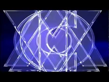
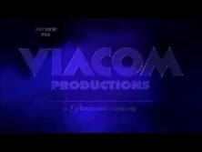
On a smoky blue background, there are the glass letters of "\/|/\CO/\/\" zooming out, being stacked in front of each other, then spreading out. The background is full of "Wigga-Wigga"-type "\/|/\CO/\/\" letters along with a blue smoke effect slowly clearing out. Underneath "\/|/\CO/\/\" is the text "PRODUCTIONS" in Futura Extra Bold font moving up ala the "Float In" animation of the Microsoft PowerPoint with a line and the byline "a Paramount company" (in the text used for the Paramount Pictures logo) fading in below "\/|/\CO/\/\ PRODUCTIONS". In 2002, the words were made bolder, and the letters at the start are brighter.
Viacom (2006-2019)[]
10th logo (2017)[]
Just the name "VIACOM" in the 2006 font appearing letter-by-letter as letters change by quickly (like the Matrix, hence the name "ViacoMatrix") in a more normal-looking font.
ViacomCBS[]
11th logo (2019-2020)[]
Amongst a hazy blue-grey background, there is the ViacomCBS logo (with a box of the same background around it) zoom out to fit with the background. They also see 2 blue-grey triangles on the side zoom out.
12th logo (2020-2022)[]
On a blue background, the text "VIACOMCBS" is copied from top to bottom about three times, then the three duplicates of the text disappear quickly. The text zooms in as series of varied blue bars slides in from the left to reveal a white background. After this, the text begins appearing in different colors: VIACOM In dark blue and CBS in sky blue.
Music/Sounds[]
1st logo[]
4 synthesized ascending pinball-like chimes. The first 3 bring up the letters to "ViACOM", and the last, which plays over the zoom-out, has a zap-like "WHOOSH" that blends in with the last bell, combined with a synth chord and gurgling/telephone-like sounds.
2nd logo[]
Here are the main music variants used on this logo:
- Usually, the music used was a 5-note synthesized fanfare, complete with a timpani drum roll playing throughout with a final, rather loud pound at the end. Even after the logo faded (or cut) to black, the timpani's echo could still be heard.
- The very first version of this logo featured the "Pinball" music from the first logo and was used eventually until late 1978 (and was also often used when replacing the original "Pinball" logo, possibly a bad plastering error). This variant is also known as the "V of Pinball".
- The very first version of the normal 1976 music had a slightly faster tempo/low-pitched version of the usual music, used on the same logo with the very dark blue/black "V" logo, and it was also used in tandem with the standard filmed variant.
- For the network TV variant, it used only the closing theme of the show or TV movie, or none.
3rd logo[]
The opening and closing themes of the syndie promo or none.
4th logo[]
After the drum roll at the start, a majestic 13-note fanfare plays, with the last note held out.
5th logo[]
The closing theme of the show/TV movie or none.
6th logo[]
The closing theme of the show. Promotional reels featured a voice over (pronouncing the name as "Vee-a-Com".)
7th logo[]
Pindrop-like synth notes, followed by a descending synth chord. The music shares a similar musical key as the "V of Doom".
Music/Sounds/Voice-over Variants[]
- The music had a couple of variations over the years. A couple of "warp-speed" versions, one of which is an ultra warp speed version featuring a higher-pitched jingle, can be seen on various programs, if they haven't been plastered.
- In some cases, it used only the closing theme of the show or none.
- Some episodes of Cannon and Perry Mason on Me-TV (before that channel received updated CBSTD prints of the aforementioned episodes of both, though the aforementioned Perry Mason prints have since resurfaced on FETV) have/had the "V of Doom" music playing over this.
- Some episodes of Gunsmoke, Matlock (seasons 1-4), and one episode of Hogan's Heroes (seen in Australia) have the "Wigga-Wigga" music playing over this. A Russian print of Father Dowling Mysteries S1 EP3 also features this over the warp-speed variant, which continues into the CBS Television Distribution logo.
- A very rare variant of the extended warp-speed (3 wipes) variant includes a voice-over. This was seen on a sales tape for the un-aired game show I Predict. As the logo animates, the voice-over is heard saying: "A Ron Greenberg Production, in association with Viacom." (Pronounced "Vee-a-com", similar to Sandy Hoyt on Split Second).
- A high tone variant exists, which is most likely from a PAL source.
- On an '80s print of the movie Running, the normal variant features two very faint copies of the theme playing and overlapping each other that are both off-sync with the animation, making them continue long after the logo fades to black.
8th logo[]
Again, there have been several musical variations accompanied with a voice-over by Don LaFontaine saying "Viacom" near the end:
- Usually, a synthesized rock score is used, complete with drums, a synthesizer and even a guitar. Telephone-like "wigga-wigga" sounds are heard as the line zig-zags.
- For the newly-formed Viacom International, the same logo is accompanied by different music. A synthesized whoosh is heard first, leading into a jingle played on a flute being heard as the line uncurls. As the logo finishes, a faint choir is heard in the background. Synthesized "shining" sounds can be heard throughout the entire logo. The LaFontaine voice-over is still heard.
- There is a version where the LaFontaine voice-over cuts in earlier.
- Some versions have no LaFontaine voice-over. The Viacom Productions logo is one of these, except the variant used on Diagnosis: Murder. An extremely short version with no LaFontaine voice-over was seen for a brief time in 1996. This version would also have the Paramount Domestic Television logo play almost immediately afterwards.
- There was a warped version during later years.
- There is a low toned variant for the short version that appeared after an episode of The Twilight Zone.
- A high pitched variant exists. It's usually seen on PAL prints of Viacom-distributed shows and movies with this logo.
9th logo[]
A descending crystallized wind chime-like sound effect culminating in a synth explosion, followed by a robotic voice saying the word "Viacom". The robotic voice was shortened in 2002.
10th logo[]
The closing theme of the program or none.
11th logo[]
2 drum hits and a loud chord (possibly the end theme of a sizzle reel)
12th logo[]
The ending theme of the show.
Scare Factor[]
1st logo[]
Depending on the variant:
- Original variant: Low to medium, bordering on high. Some may be startled by its choppy animation, fast pace, "zoom-out", and the somewhat weird music, especially on distorted prints.
- Silent variant: Low.
- In-credit variants: None.
2nd logo[]
Depending on the variant:
- Videotaped variant: None to medium, thanks to the smoothened motion of the moniker and V. The logo itself may be higher in quality, lowering the scare factor. However, the fanfare may still spook some.
- Warp speed variant: None to high. May not be scary for those who are used it, but for the other viewers it might seem as the V is charging towards you at full speed.
- Filmed variant: None to nightmare. The sudden stop of the moniker may scare some. The amount of scratches and how much the logo's music is warped may vary from different reels that you watch. On the flip side, it's an iconic logo that is embraced all round the logo community.
3rd logo[]
Minimal to low. It may surprise some people who are expecting the "V of Doom.” If Viacom made any feature movies at the time, this was definitely the logo to go with. And it is a great logo and is a favorite of many.
4th logo[]
Minimal to low. This is a beautiful logo, and a refreshing logo, and a favorite of many.
5th logo[]
None. This is either a calm or boring logo, depending on what you think.
6th logo[]
None. It's a precursor to the "V of Steel" logo.
7th logo[]
Depending on the variant:
- Original/Extended/B&W/Distribution: Low. The descending sound, sounding like the THX "Deep Note", and the big "V of Doom" styled "V" might have scared a few here and there, but it's harmless.
- Warp speed variants: Low to medium. The fast pace may surprise some first-time viewers.
- With the "V of Doom" theme: Low.
- With the "Wigga Wigga" theme: Low.
- Silent variant / with the closing theme: Minimal to low.
Nonetheless, like the "V of Doom", "V of Rainbow", and 4th logos, this is a very good logo, and it is a favorite of a lot of people.
8th logo[]
Depends on the variant:
- Domestic variant: Minimal to low. Some might be caught off-guard by the dramatic FX and fast pace.
- International variant: None. This is a beautiful logo.
- With the "Pinball" theme (?): Low to medium, since it may surprise anyone who wasn't expecting it.
- With the "V of Doom" theme: Minimal to low.
- "Ghost of the V of Doom" variant: Minimal to low.
- "Ghost of the V of Steel" variant: Minimal to low. The theme may startle a few that were not expecting it. But like the above variant, most wouldn't notice it anyway.
- With the "V of Steel" theme: Minimal to low.
- With the warp-speed "V of Steel" theme: Low, especially if you weren't expecting it.
- With the "Wigga Wigga II" theme: Low.
- With the closing theme: Minimal to low.
Apart from these, this is still fairly tame, and one of the greatest logos from Viacom, joining the 4th logo, the "V of Doom", the "V of Rainbow", and the "V of Steel". It is also a favorite of many.
9th logo[]
Depending on the variant:
- Original variant: Minimal to low. The robotic voice may get to some.
- With the "Wigga Wigga" music: Low.
It's not a well-known logo like the previous ones, but it's another well-made logo with some really cool effects. This was also a fitting way to end a company with an amazing and memorable library of logos before being merged with CBS in the future, giving out more logos.
10th logo[]
None, though it may surprise those expecting to see the Spike Originals logo. In any case, it looks pretty cool for a modern-day simplistic logo.
11th logo[]
Low to medium, because of the loud chord, but it is rather a disappointment than scary.
12th logo[]
None.
Videos[]
Gallery[]
|
|
Viacom International (CBS) |
|
