Logos[]
1st logo: On a black background, several stars join together at the right of the screen to form the constellation of the lion. As this happens, a stylized white drawing of a lion standing on its hind legs and looking to the right (in a heraldic "lion rampant" pose) fades in. ''LIONS GATE'' fades in the Bernhard Modern font, then ''FILMS'' and ''PRESENTS''.
Variant[]
On the trailer for Buffalo '66, it doesn't have the word ''PRESENTS''.
2nd logo: Against a dark blue starfield background, several stars swirl around to form the lion logo from before, which zooms out. Some more stars that turn from white to gold zoom-out and arrange themselves on the logo, and the words "LIONS GATE FILMS", in gold, flash in at the top right of the lion. A burst of light wipes in a white line with the byline "A LIONS GATE ENTERTAINMENT COMPANY" underneath it. The words sparkle a bit.
Variants[]
- This logo exists in filmed and videotaped forms.
- Billed as "FILMS LIONS GATE" on French-Canadian releases.
- On an international video trailer for Perfume, "INTERNATIONAL" is placed in between "FILMS" and the byline.
- Starting in 2003, "AMEX: LGF" appears underneath the byline ("AMEX" as in the "American Stock Exchange", not the "American Express").
3rd logo: Against a dark sky with clouds and thunder, the letters "LGF", followed by "LIONS GATE FILMS" below, appear in a "flashing" effect. It zooms forth, and the Lions Gate byline from before gets wiped in from left to right.
Variants[]
- On some films, the logo is tinted green.
- A print logo is used at the end of many films (same type for the previous logo).
4th logo: There is the black letters "LGF" with "LIONS GATE FILMS" below (all separated by two lines). A blue spotlight passes on the background. Suddenly the words switch to blue, and the background fades to black. The logo zooms in. Then the light streak draws the same byline as the previous logo.
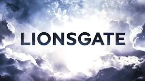
5th logo: They fade in close to several gears and zoom out to a view of them rotating in a large Art Deco-inspired chamber. The camera then zooms all the way back and out through a keyhole, revealing an enormous pair of doors, with the company's "lion rampant" logo on both of them (intended to evoke its heraldry-inspired appearance) and a geometric pattern as well. The doors open and there is the name "LIONSGATE", now written as one word and with a metallic texture, over a heavenly sky background with clouds surrounding it.
Variants[]
- There is a version which appears on horror and action films (basically, wherever a "rugged" appearance is desired), where the gears and doors are rusted, and the "LIONSGATE" text appears over a hellish red sky, showing more wear than it does in the standard version. This version is known as "Lionsgate Horror".
- On current prints of Star Kid, the logo plasters the Trimark Pictures logo and is sped up to accommodate the length of the original logo. The film's opening music is left intact.
- The print version with black text on a white background is used on The Expendables 2 and Reservoir Dogs video games.
- A shorter version starting from the zoom out through the keyhole exists.
6th logo: There is the horizon of the earth surrounded by clouds as it zooms away from us. Stars fly past us as they form a lion constellation based on the first two logos. As soon as the constellation forms, it is seen reflected on "S" of "LIONSGATE" in 3-D lettering as the word flies past through the clouds from the fifth logo. A light shines through the "S" and the "G" as the name is revealed in a deep blue. The clouds swoop away, leaving the light.
Music/Sounds[]
1st logo: A majestic, ethereal synth theme coupled with whooshing and shining sounds.
2nd logo: Same as the last logo. Sometimes, it is silent or has the film's opening theme.
3rd logo: Usually silent, but some films use thunderclap sounds with the sound of a sword being drawn and hitting another sword.
4th logo: First we can hear a whoosh, then vibration sounds, and finally the streak drawing.
5th logo: A majestic fanfare (which takes cues from Danny Elfman's Batman theme) for the standard version. The horror version has the sounds of the gears cranking and door creaking, alongside sounds resembling a heartbeat and moaning. The short version uses mechanical noises. On rare occasions, both versions are silent or have the film's opening theme playing over them.
Music/Sounds Variant[]
On Syfy airings of Leprechaun 2, the Trimark Pictures theme was heard over the first half of the logo, and the Lionsgate theme played over the second half of the logo, possibly due to an editing error or cheap plastering.
6th logo: A triumphant fanfare composed by Jason Johnson. Like the last logo, sometimes it is silent or has the film's opening theme heard over it.
Scare Factor[]
1st logo: Low to medium, the music and whooshes may be startling, but it's harmless.
2nd logo: Minimal to low. It's fine, but nothing compared to...
3rd logo: Minimal to low, mainly due to the thunders, but it is tame as it is silent. None for the still variant. Medium to high for the sound variant because of the thunderclap and swords.
4th logo: Low.
5th logo:
- Minimal to low for the original version. The animation is very fascinating, and is a favorite to many.
- Medium to nightmare for the horror variant. The gears and doors being rusted is one thing, along with the hellish sky, but the sounds will definitely scare a dozen of people, especially those who are watching it in the dark. Of course, this was intentional. May be lower for those who are used to it, especially those that are fans of the Saw franchise.
6th logo: None. This is an amazing logo with mind blowing animation and an amazing soundtrack. Like the OG version of the previous logo, it is a favorite of many. It is also tamer than the horror variant of the previous logo.
