Logos[]
1st logo (Late 1980s)[]
On a background that lightens up, two gray squares containing an outline of a drawn owl, with a triangular bottom are seen stretching. One of them faces the whole screen. The owl gets filled up with a wiping brown color from below, as the background turns into a gray/black gradient. It then zooms out a bit, making space for the white word "Colcultura", which fades in. "Inravision - Audiovisuales" fades in below.
2nd logo (1991?-1996)[]
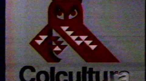
We already see the owl from the previous logo on a gray background, but now a bit darker and in 3D. The letters of "Colcultura", now black," zoom in to below with the help of squares which disappear after they're placed. The word then shines.
Variant[]
A short version exists, which appears at the end of programs
Music/Sounds[]
1st logo[]
A 4-note low synth with the last note held until the ending (sounding similar to the TPS "Rainbow" logo), with a sparkling synth pad later, a dramatic 2-note synth, then other synths which filter out.
2nd logo[]
A deep held synth drone which sounds like the one from the previous logo, some descending dripping sounds, and the female announcer saying in Spanish,
- Opening: "Colcultura presents"
- Closing: "Colcultura brought you the previous program".
Scare Factor[]
1st logo[]
Low to nightmare. The sinister drawing of the owl, the creepy, mysterious, over-synthesized music and slow pace makes this logo not acceptable for a dark environment. However, you could laugh at that primitive animation, in particular if you would compare this to what followed.
2nd logo[]
- Long Version: Low to medium. The droning synth music, 3D owl and announcer may still get to you, although this feels more tame compared to before. It's a lot better than before.
- Short/Dark Version: Medium. Evidence is still needed about the darkness being intentional or not, but regardless the logo being shorter tones down the scare factor. Not to mention it still resembles an angry menacing dragon. It's still much tamer than the infamous 1st logo.


