Logos[]
1st logo (1998)[]
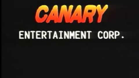
On a black background, we see the yellow word "CANARY" emerging from the top followed by many shadows and moving up, like the 1st Telepictures logo. After placing off-center, the word "glows" and "FILMS" fades in.
2nd logo (2003-2008)[]
On a black background, a laser appears and draws parts of a stylized C, which rotates and faces to us with many lines preceeding it, kinda like the 1988 Carolco logo. The C zooms out to the left side of the screen and a line is drawn. The letters of "CANARY FILMS", on a font which looks like Goudy Stout come out of the line and the C stops.
Music/Sounds[]
1st logo[]
A calming synth pad, along with a weird warbling sound followed by a laser zap.
2nd logo[]
Another synth pad which gets more calmer at the end. Some films have the opening theme with sounds.
Scare Factor[]
1st logo[]
Medium, because of the contrast of a dark background and bright colors, huge text, and weird theme. But you must laugh at the cheesiness of the logo.
2nd logo[]
Minimal due to the fast pace, but fans of the Carolco logo may like this.
Video[]

Canary Entertainment Corp.
